Opening the Shadows
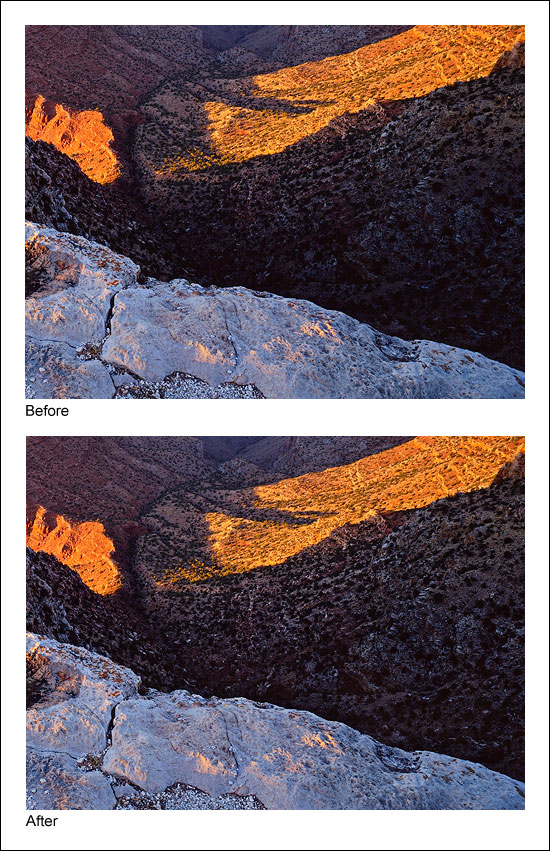
The shadow area on the right just below the rim is a completely different situation. Here the problem is that the area is too dark and lacking in detail. The desired remedy is to increase brightness and contrast in a controlled fashion so that there is greater detail, while at the same time preserving the blackness of the darkest elements to avoid a washed-out look that too-light shadows can have. Figure 11 shows the area before and after luminosity painting.
Figure 11
|
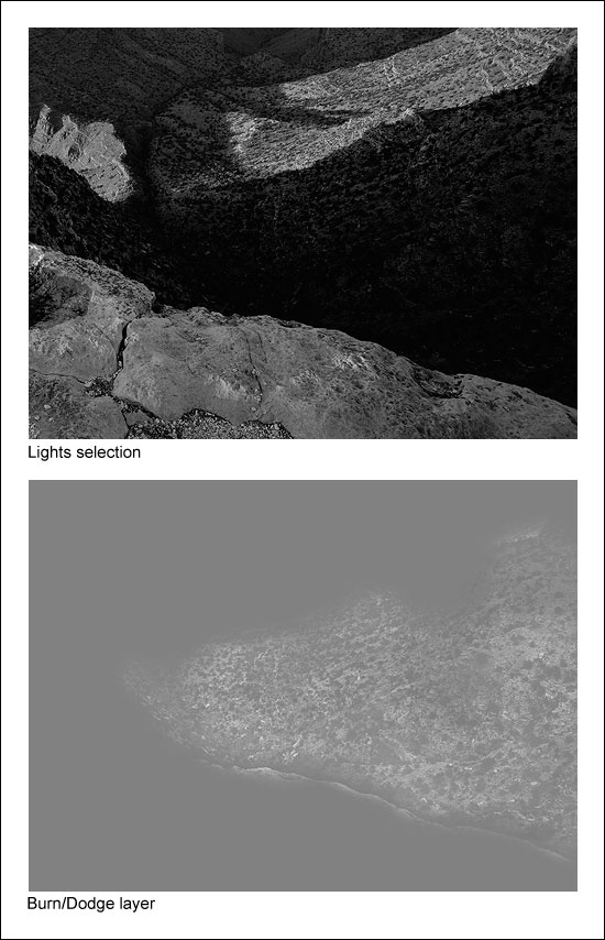
Figure 12 shows the selection that was painted through, in this case the Lights selection, and the resulting Burn/Dodge layer that created this effect.
Figure 12
|
Once again, the tonal outline of the area is clearly visible on the Burn/Dodge layer. That's because white paint was applied to the layer through the Lights selection. Like in the first example, painting through a luminosity selection will lay down paint in proportion to the brightness of each pixel creating an outline of the image. But since there are almost no light tones in this shadow area, it's reasonable to wonder if painting through a Lights selection will have any effect on the dark tones? The answer is "Yes." Even though this area is quite dark to begin with, there is still tonal separation. The Lights selection partially and properly selects the darker pixels in proportion to their level of brightness. Several passes with a high-opacity brush (75% in this case) can still force some paint to be deposited onto the Burn/Dodge layer through these weakly selected pixels. Since painting through the Lights selection causes lighter pixels to get more paint, painting white into the shadows through this selection exaggerates the small degree of tonal separation that does exist. White paint on a Burn/Dodge layer dodges or lightens the colors beneath it. The gradient of white paint established by the Lights selection therefore opens up the shadows quite nicely as it creates the visible "imprint" of the scene on the Burn/Dodge layer.
Painting through a Lights selection probably seems counterintuitive in this case. Selecting the shadow tones that are too dark with one of the Darks-series masks (Darks, Dark Darks, Shadow Darks, Super Darks, or Ultra Darks) and then painting white through it would seem to be a more efficient strategy to lighten the dark areas. It would be easy to get lots of white paint onto the dark pixels of the Burn/Dodge layer by painting through some well-selected dark pixels. Unfortunately, while it would indeed be more efficient, it would not be effective at maintaining the desired contrast in the area that is being painted. Remember, the goal in this situation is to leave the darkest values mostly unaffected by the painting. This maintains the strength of the shadows in the image. Painting through any of the Darks-series selections, however, would do just the opposite. Because of how the Darks-series of luminosity masks is created, the darker the tone, the more it is selected. So if any of the Darks-series selections were painted through, the darkest dark tones would receive more white paint than the lighter dark tones on the Burn/Dodge layer. This causes the darkest dark tones to turn lighter faster than the lighter dark tones. So by painting white through any of the Darks-series selections, the darkest dark tones start "catching up" to the lighter dark tones in brightness. As such, the tonal separation between the darkest dark tones and the lighter dark tones effectively decreases, and so does contrast. So in order to maintain contrast—and actually increase it a little—the white paint needs to be applied through one of the Lights-series selections. The next section reviews the strategy for deciding which type of selection, Lights-series or Darks-series, to paint through.